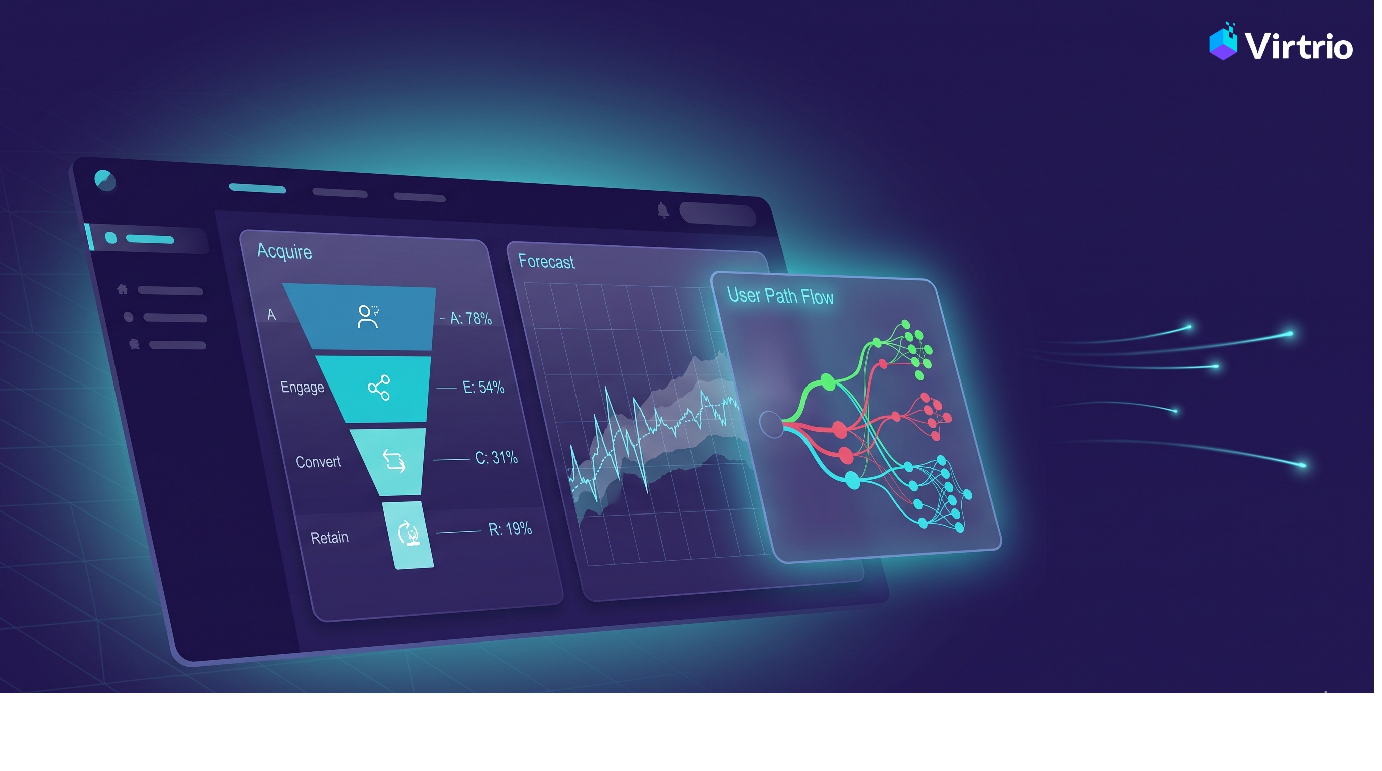
Every virtual event platform can tell you who registered, who logged in, and what got downloaded. Those are table stakes. What almost none can tell you is the question that actually shapes whether your next event beats your last: how did people move through it?
That's the gap Virtrio's new Canvas Navigation-Flow report closes. It turns the movement data your event already generates into a clear, visual map of how attendees travelled between rooms — revealing the popular paths, dead ends, and doors nobody opened.
Why movement is the metric you've been missing
Virtrio events live on an immersive 2.5D canvas. Instead of a flat list of sessions, attendees experience your event as a series of connected spaces — a lobby, stages, networking lounges, sponsor booths — and they navigate between them by clicking hotspots you place during room design.
That navigation is rich behavioural data. Every move from the lobby into a keynote, every detour into the exhibition hall, every attendee who reached a networking room and never came back tells a story about your event's design. Until now, that story was invisible — the movement happened, but it was never brought to light.
Navigation-Flow surfaces it. And because Virtrio events are a space people move through rather than a list they scroll, this is a picture you can only get here.
What the report shows you
Open it from your organiser dashboard under Insights → Navigation Flow, and you get a complete picture of attendee movement:
Popular paths. A ranked view of the most-travelled room-to-room transitions across your whole audience. At a glance, you see the highways of your event — the routes attendees naturally take — versus the side streets nobody walks. If most attendees go from the lobby to the main stage but almost none discover your networking lounge, that's a layout problem you can fix.
Dead-end and low-traffic rooms. The report flags two kinds of problem space. Low-traffic rooms are ones no path ever leads into — effectively orphaned, invisible to the flow of the event. Dead ends are rooms that attendees enter but never leave, suggesting a missing exit or a layout that traps people. Either way, you learn exactly where attendees get stuck or never arrive.
Ignored navigation hotspots. This is the clever part. When you design a room, every link you place is an intended path — a door you expected attendees to walk through. Navigation-Flow compares your intended layout against what actually happened and lists every link no attendee ever used. Maybe it's hidden behind a banner, maybe its label is unclear, maybe it leads somewhere people don't care about. Now you know which hotspots are wasted real estate.
Entry points, exit points, and depth of exploration. The report identifies where attendees start (their first room) and where they drop off (their last room), as well as the average number of distinct rooms each attendee visited. A low average tells you people aren't exploring; a surprising exit room tells you where you're losing them.
Built on principles, not bolt-ons
Two design choices matter here.
First, it's a pure read-and-aggregate layer. Navigation-Flow adds no new attendee-side tracking. It works entirely on data Virtrio already captures, which means it costs nothing extra to run and respects our principle that engagement features stay opt-in. If an event hasn't enabled engagement tracking, the report shows a clear "tracking not enabled" state rather than a confusing error — and turning tracking on is a single click away.
Second, it's honest about zero-states. No data yet? You see a friendly "once attendees start moving between rooms, their paths will appear here" message, not an empty void. Every edge case is a deliberate, explained state — and the report stays fast and responsive even across large, busy events.
Who should use it — and how
Organisers use Navigation-Flow to diagnose and redesign. After an event, the dead-end and ignored-hotspot callouts become a punch list for your next layout: add the missing exit, relabel the confusing link, and promote the orphaned lounge from the lobby. Over a few events, you can measurably increase the depth of attendees' exploration.
Resellers use it as a coaching and differentiation tool. Across your book of business, you can show organisers concrete evidence of what worked and what didn't — turning an abstract "make it more engaging" into a specific, visual to-do list.
And when you need the data elsewhere, a one-click CSV export gives you the full transition matrix — every from-room, to-room, count, and whether it matched a designed path — ready for your own analysis or a board deck.
The bottom line
Your event isn't a list of sessions. It's a space people move through. Canvas Navigation-Flow finally lets you see that movement — the paths they love, the rooms they miss, and the doors you built that nobody walked through.
Better data leads to better design. Better design leads to events attendees actually explore. And that's a story worth telling your stakeholders — backed, for the first time, by the map of how your event really happened.
Canvas Navigation-Flow is available now in the Insights section of your Virtrio organiser dashboard.



.jpeg)